Tag:
Photoshop
Nature sketch
SARS-CoV-2
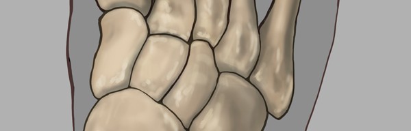
Foot
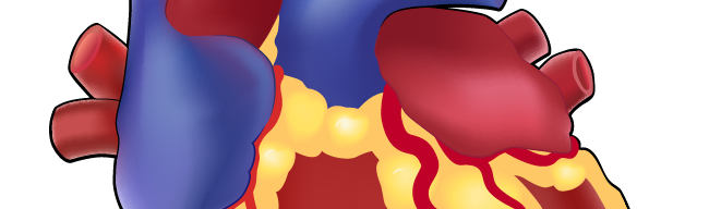
Heart
Teeth
Eye
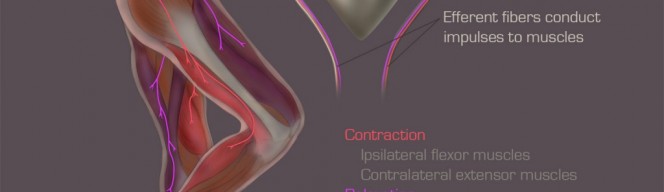
Nerves
Brain
Muscle
Osteoclasts
Next Page
→